|
Discount Type |
Purpose |
Example |
|
Quantity-based offers |
Encourage bulk purchases |
Buy 3, Get 20% Off |
|
Prepaid discounts |
Reduce COD orders |
Extra 5% Off on Prepaid |
|
First-purchase incentives |
Convert new customers |
FIRST10 for 10% Off |
|
Cart value tiers |
Increase Average Order Value |
Spend ₹2000, Save ₹200 |
How KwikAds helped Shop Unrush boost ROAS by 37% in 3 months
How KwikAds helped Shop Unrush boost ROAS by 37% in 3 months
How KwikAds helped Shop Unrush boost ROAS by 37% in 3 months
How KwikAds helped Shop Unrush boost ROAS by 37% in 3 months
Kwik Checkout
How to Build a Seamless Checkout Process in eCommerce
 26 Mar 2026
 15 Min Read
Atul leads marketing at GoKwik, championing D2C brand building, growth strategies, scalable GTM for e-commerce, and data-driven customer acquisition. A former Amazon leader and IIFT MBA alumnus based in Bengaluru, he brings 15+ years scaling business across e-commerce, and fintech.
Read this blog on your favourite platform
Ever watched a customer add items to their cart, click checkout, and then... nothing? They disappear. It happens more often than you'd think, and it's costing you serious revenue.
Building a seamless checkout process isn't just about making things look pretty. It's about removing every possible roadblock between "I want this" and "Order placed." When your checkout process works smoothly, customers complete purchases. When it doesn't, they leave for competitors who make buying easier.
For Indian D2C brands, the pressure is intense. Your customers are shopping on their phones during commutes and lunch breaks. They expect to checkout in seconds, pay via UPI or COD, and never have to type their full address on a tiny keyboard. Miss any of these expectations, and you've lost the sale.
In this guide, we'll show you exactly how to build a checkout process that converts.
Key Takeaways:
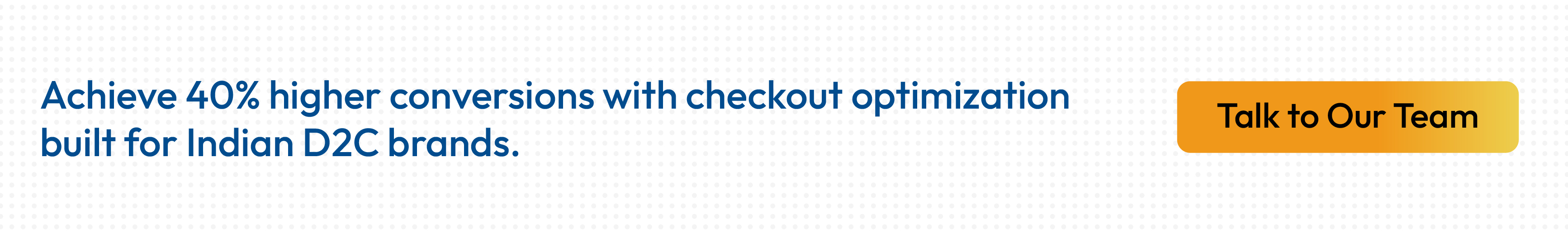
- Address auto-fill can reduce checkout time to 30 seconds and improve conversions by 40%
- Guest checkout removes registration barriers that cause immediate abandonment
- Mobile-optimized checkout is essential as smartphones drive the majority of eCommerce traffic
- Smart payment routing achieves 95% payment success rates across multiple gateways
- Transparent pricing and strategic discounting prevent surprise-cost abandonment

What is the Checkout Process in eCommerce?
The checkout process is the series of steps a customer completes to finalize a purchase on an eCommerce website. It starts when someone clicks "checkout" from their cart and ends with order confirmation.
A typical checkout involves three core stages:
A typical checkout involves three core stages:
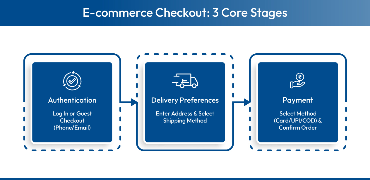
- Customer Authentication: The shopper identifies themselves through phone number and OTP, email login, or guest checkout. This establishes who's making the purchase and where to send order updates.
- Delivery Details: Customers provide their shipping address, select delivery methods, and indicate any special instructions. This stage also calculates shipping costs and displays estimated delivery dates.
- Payment Processing: The shopper selects their preferred payment method (UPI, cards, wallets, COD, etc.), completes the transaction, and receives immediate order confirmation with tracking details.
Each stage presents potential friction points where customers might abandon. The goal is making these steps as quick and intuitive as possible, especially on mobile devices where most Indian shoppers complete their purchases.
Now that you understand the basic framework, let's dive into the specific strategies that transform average checkouts into conversion machines.
8 Essential Ways to Build a Seamless Checkout Process
A seamless checkout process doesn't happen by accident. It requires deliberate design choices that prioritize speed, simplicity, and user control at every step.
The strategies below address the most common friction points that cause customers to abandon their purchases. Some are quick fixes you can implement today. Others require more sophisticated technology solutions. Together, they create an eCommerce checkout experience that converts browsers into buyers.
The strategies below address the most common friction points that cause customers to abandon their purchases. Some are quick fixes you can implement today. Others require more sophisticated technology solutions. Together, they create an eCommerce checkout experience that converts browsers into buyers.
1. Design a Clean, Distraction-Free Checkout Interface
If a shopper has reached the checkout page, it means you've done a lot of things right. Now, at this point, you should make it even simpler and easier for them to complete their purchase. That means removing all the distractions.
Clutter-free pages have more benefits on customer psychology and behavior than you could imagine. You can drive customers to take your desired actions, pages load faster because there are fewer elements, and simple designs don't make the page look overly salesy.
Clutter-free pages have more benefits on customer psychology and behavior than you could imagine. You can drive customers to take your desired actions, pages load faster because there are fewer elements, and simple designs don't make the page look overly salesy.
How to ensure a clean checkout design:
- Remove extra elements such as menu, product recommendations, and promotional banners
- Have minimal elements on the page to ensure visual clarity
- Use a clear call to action (CTA) button to drive customers toward converting
- Provide a progress bar so customers know how close they are to completing the purchase
- Ensure the page loads fast
2. Optimize Your Checkout Process for Mobile Commerce
Smartphones now account for 87% of online sales. While mobile shopping is on the rise, eCommerce retailers still struggle to provide the best user experience and seamless checkout on smaller screens.
The challenge? Smaller screens make form-filling tedious, touch targets need to be thumb-friendly, and connection speeds vary dramatically. Your checkout must work flawlessly despite these constraints.
The challenge? Smaller screens make form-filling tedious, touch targets need to be thumb-friendly, and connection speeds vary dramatically. Your checkout must work flawlessly despite these constraints.
Here's how to ensure your online store is mobile-friendly:
- Keep only relevant information, remove unnecessary content
- Have an appropriate size and resolution for images to fit the mobile screen
- Remove popups and sidebars as they distract and are difficult to close on small screens
- Place forms and CTAs in spaces that are easier to click and reach with the thumb
- Display mobile-first payment modes such as UPI payments, wallets, etc.
- Make mobile-friendly payment methods as the preferred modes to make checkout faster
- Provide autofill for address as filling forms on small mobile screens is difficult and time-consuming
3. Implement Address Auto-Fill and Smart Form Fields
Most eCommerce retailers focus on the bigger aspects of the website like the landing page, product pages, images, product information, etc. In the process, they forget about the details like address auto-fills and forms in the checkout field.
It may seem like a small aspect of your customers' purchase journey, but take a deeper look at it, and you'd be surprised. It's one of the biggest pain points of customers, and it can make or break your sales.
Having to manually fill details can annoy customers as it is a repetitive task, tedious, and time consuming. The solution: auto-fill these mundane forms.
Benefits of auto-fill on the checkout page:
- Makes the checkout process faster and easier, and saves time
- Increases conversions and revenue generation
- Gives a professional outlook and builds reliability and trust
- Boosts customer satisfaction
- Auto-fill is a form of personalized customer experience
- Ensures the correct addresses and eliminates errors, saving time and energy
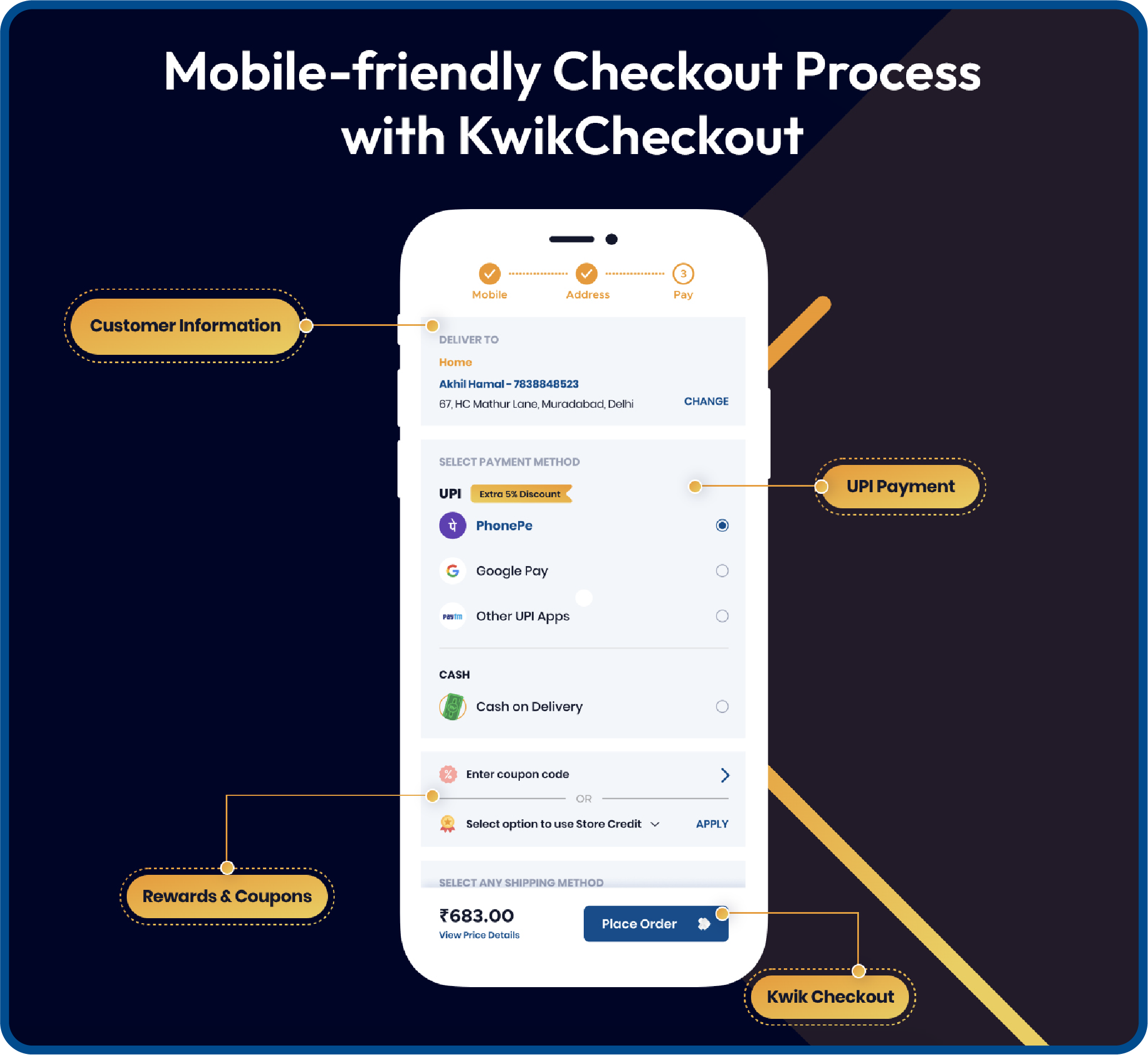
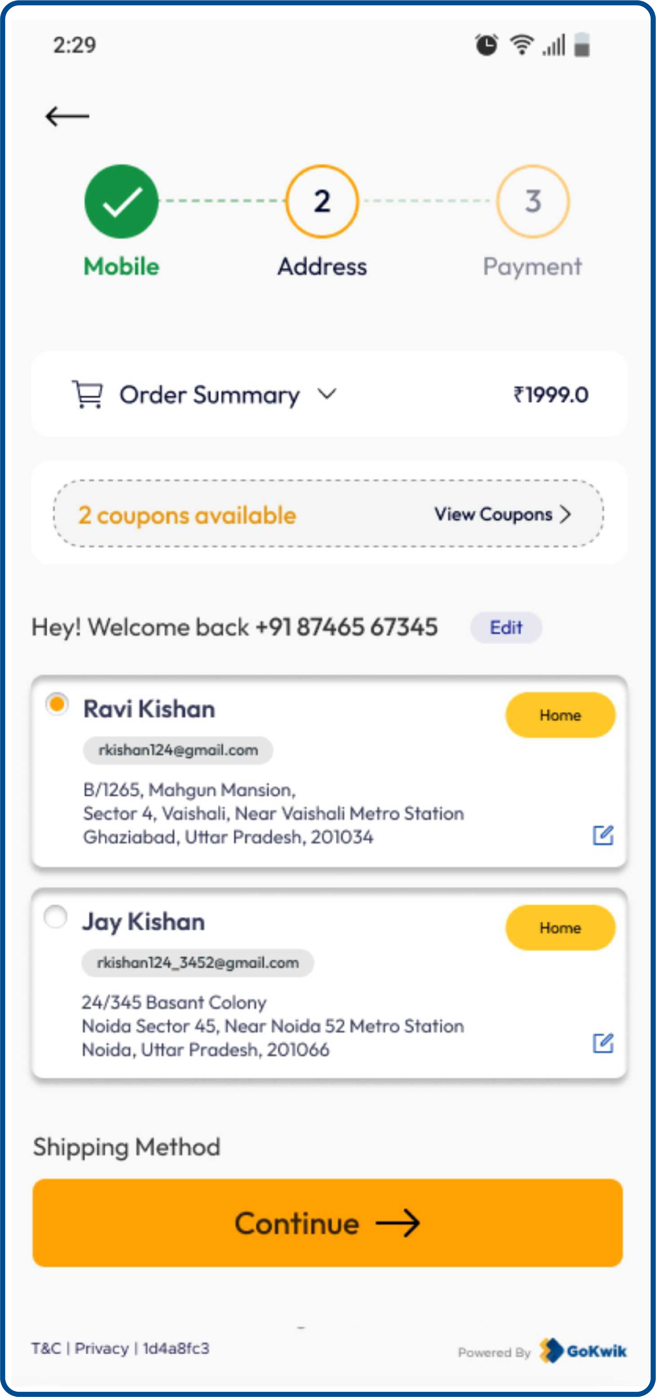
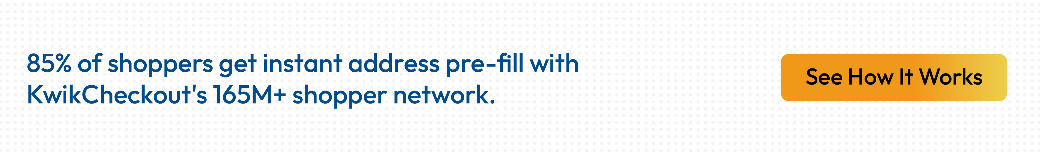
The most effective auto-fill solutions use network data to recognize shoppers across multiple stores. For example, if someone has previously purchased from any brand using the same checkout infrastructure, their address and credit card details can auto-fill even when they're shopping with you for the first time. This approach achieves significantly higher pre-fill rates compared to systems that only recognize a merchant's own customers.
GoKwik helps brands extend this service to their customers. Owing to its vast network of data driving 40% SSO logins and 85% address pre-fills, any customer shopping on its partner merchant's website such as boAt, Noise, Foxtale, Swiss Beauty, Urban Gabru, etc., will see their address get auto-filled. This allows them to skip the tedious task of filling details and experience a seamless checkout process.
GoKwik helps brands extend this service to their customers. Owing to its vast network of data driving 40% SSO logins and 85% address pre-fills, any customer shopping on its partner merchant's website such as boAt, Noise, Foxtale, Swiss Beauty, Urban Gabru, etc., will see their address get auto-filled. This allows them to skip the tedious task of filling details and experience a seamless checkout process.
4. Enable Frictionless Guest Checkout Options
Forced account creation is one of the fastest ways to lose ready-to-buy customers. When shoppers have decided to purchase, every additional requirement increases abandonment risk.
Guest checkout respects customer preferences. Many people want to complete their purchase without creating another account or remembering another password.
Guest checkout respects customer preferences. Many people want to complete their purchase without creating another account or remembering another password.
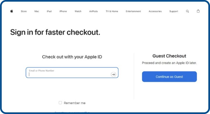
Implementation tips:
- Make one-click checkout the prominent default option. Never force login or registration to complete a purchase.
- Collect only essentials: phone number, email address, and delivery address. Nothing more.
After successful purchase, offer optional account creation. Customers are satisfied at this moment and more receptive to building an ongoing relationship. Their information is already saved, making registration a single click.
For those who want accounts, implement one-click social login through Google or Facebook to reduce registration friction. Some checkout platforms like Kwik Checkout take this further by automatically recognizing returning shoppers across their merchant network, eliminating the login step entirely for customers who've previously purchased from any participating brand.
For those who want accounts, implement one-click social login through Google or Facebook to reduce registration friction. Some checkout platforms like Kwik Checkout take this further by automatically recognizing returning shoppers across their merchant network, eliminating the login step entirely for customers who've previously purchased from any participating brand.
6. Create Informative Order Confirmation Pages
The order confirmation page is another underdog that's a part of a seamless checkout process and can help you win conversions. But most likely you never paid attention to it.
Imagine yourself as a customer. You make a purchase on an eCommerce website. And all you get is a 'Thank You For Your Purchase' pop up. Instead, you should be taken to an 'Order Confirmation' page, which displays the order details, the expected delivery time, your delivery address, and other important details.
The latter would surely make you feel more satisfied.
The order confirmation page can also be optimized for future sales, customer loyalty, and engagement.
Here's how to make the most of the order confirmation page:
- Provide a confirmation of the transaction
- Provide a quick overview of the order and other details
- Keep the text simple and information relevant
- If it's a guest checkout, urge the customer to register for better perks in future
- Include delivery and shipping details
- Mention cancellation and return policies
- Mention customer support contact details
- Include social media buttons to keep the engagement going
7. Make Discount Codes and Promotions Easy to Apply
Customers expect discounts. When they don't see promo code options at checkout, many leave to search for coupons online and never return.
The challenge is making discounts accessible without encouraging discount-hunting behavior that delays purchases.
The challenge is making discounts accessible without encouraging discount-hunting behavior that delays purchases.
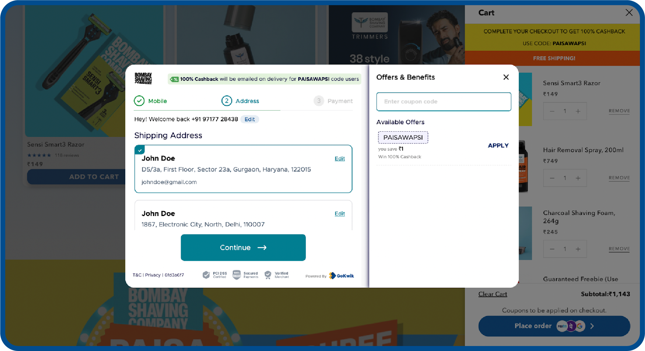
Smart discount strategies:
- Display promo code fields prominently but not disruptively. Auto-apply the best available discount whenever possible.
- Show reward points, loyalty program or store credit balances clearly. Many customers forget they have credit available.
- Integrate with popular loyalty programs like Twid, SuperCoins, or OneCard for seamless redemption. Surface relevant offers based on cart contents.
Display "You Saved ₹X" messaging prominently to reinforce value.
Advanced checkout platforms offer extensive discount configurations, giving you flexibility to place incentives exactly where they'll drive desired behaviors, whether that's increasing order values or encouraging prepaid payments.
8. Allow Easy Order Review and Modification
One of the most important eCommerce checkout page best practices is to allow customers to review and edit their purchase details.
Imagine this, customers may have added products by mistake or may have added wrong products, or may want to change the quantity, choose a different payment mode (Google Pay, Apple Pay) etc.
If you make the process of reviewing their purchase details and editing them difficult, customers might feel frustrated. And they may not have the energy to go through the entire shopping process all over again.
You can make their online shopping experience better by permitting them to easily modify their orders. The more power and flexibility you give to customers, the easier it will be for you to close sales.
What to enable:
- Display complete order summary at every checkout stage with clear product images, names, and prices
- Allow quantity changes directly within checkout
- Make product removal obvious with clear delete buttons
- Let customers edit delivery addresses after initial entry
- Enable payment information switching before final confirmation
- Include an "Edit Cart" option that returns to the cart without losing progress
- For uncertain items, implement "Save for Later" functionality
When customers feel in control and able to make changes, they experience less purchase anxiety. This confidence translates directly into higher completion rates.

These eight strategies form the foundation of effective checkout design. But knowing what to do is only half the battle. Understanding what not to do is equally important.
Common Checkout Process Mistakes That Kill Conversions
Even with the best intentions, many eCommerce brands unknowingly sabotage their own checkout processes. These mistakes drive customers away right when they're ready to buy.
Understanding what not to do is just as important as implementing best practices.
Understanding what not to do is just as important as implementing best practices.
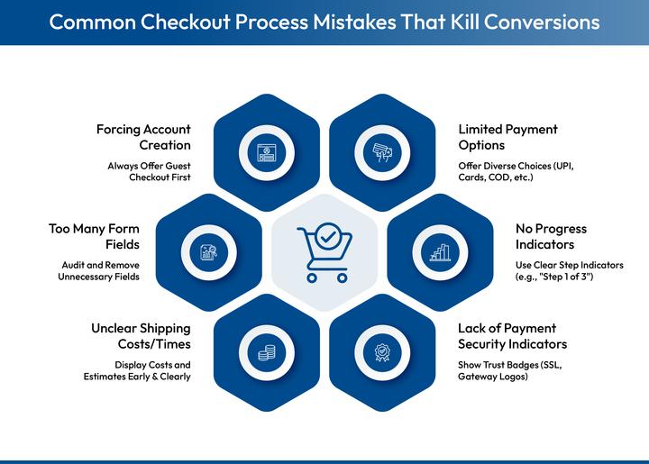
1. Forcing Account Creation Before Purchase
Mandatory registration creates friction exactly when you want minimal barriers. Customers must fill extra forms, create passwords, and verify emails when they just want to complete their purchase.
The fix: Always offer guest checkout as the default. Encourage optional registration after purchase when customers are satisfied and more receptive.
The fix: Always offer guest checkout as the default. Encourage optional registration after purchase when customers are satisfied and more receptive.
2. Too Many Form Fields and Information Requests
Every additional field increases cognitive load and completion time. Common culprits include redundant billing addresses, non-essential company names for B2C purchases, and marketing preferences that interrupt the eCommerce checkout flow.
The fix: Audit every field. Remove anything not absolutely necessary to complete the order. Use smart defaults and only show additional fields when relevant. For Indian eCommerce, pin code alone can determine city and state.
The fix: Audit every field. Remove anything not absolutely necessary to complete the order. Use smart defaults and only show additional fields when relevant. For Indian eCommerce, pin code alone can determine city and state.
3. Unclear Shipping Costs and Delivery Times
Discovering shipping costs late in checkout or not knowing when orders will arrive creates uncertainty that prevents completion.
The fix: Display shipping costs on product pages. Show estimated delivery dates during checkout. Use pin code detection for accurate estimates. If offering free shipping thresholds, display progress toward qualifying.
The fix: Display shipping costs on product pages. Show estimated delivery dates during checkout. Use pin code detection for accurate estimates. If offering free shipping thresholds, display progress toward qualifying.
4. Lack of Payment Security Indicators
Without visible trust signals, many shoppers abandon rather than risk fraud, especially first-time customers or those unfamiliar with online transactions.
The fix: Display SSL certificates, payment gateway logos from recognized providers, and security certifications prominently. Use HTTPS throughout checkout. Show money-back guarantees for high-value orders.
The fix: Display SSL certificates, payment gateway logos from recognized providers, and security certifications prominently. Use HTTPS throughout checkout. Show money-back guarantees for high-value orders.
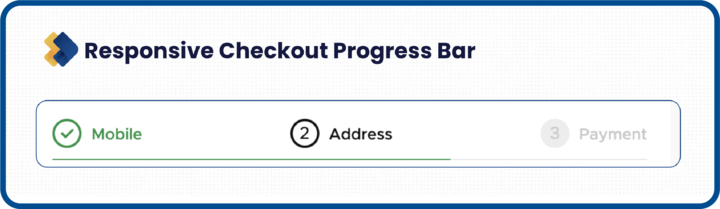
5. No Progress Indicators on Multi-Step Checkout
When customers don't know how many steps remain, uncertainty creates anxiety that triggers abandonment.
The fix: Use clear step indicators like "Step 2 of 3." Label each stage clearly. Highlight the current step and show completed ones. Keep total steps to 3 or fewer.
The fix: Use clear step indicators like "Step 2 of 3." Label each stage clearly. Highlight the current step and show completed ones. Keep total steps to 3 or fewer.
6. Limited Payment Options
Indian consumers have diverse payment preferences varying by region, age group, and purchase category. Limiting options excludes potential customers.
The fix: Offer comprehensive options including UPI, cards, wallets, netbanking, BNPL, and COD. Display them clearly. Use smart payment routing that automatically switches to the best-performing gateway in real-time for 95% or higher success rates.
The fix: Offer comprehensive options including UPI, cards, wallets, netbanking, BNPL, and COD. Display them clearly. Use smart payment routing that automatically switches to the best-performing gateway in real-time for 95% or higher success rates.

Now that you know what to implement and what to avoid, let's look at how leading brands are achieving exceptional checkout performance.
How Kwik Checkout Builds the Perfect Ecommerce Checkout Process
Building a truly optimized checkout requires sophisticated technology infrastructure that most merchants can't develop in-house. Kwik Checkout sits between your shopping cart and payment processing as an intelligent optimization layer, removing friction and accelerating conversions through network data advantages.
Key features:
- Network-powered address auto-fill: 85% pre-fill rate using verified first-party data from 120M+ shoppers
- Smart payment routing: 95% payment success rates through dynamic gateway switching
- One-click authentication: 35% auto-login rate via SSO for returning network shoppers
- Advanced discount engine: 250+ configurations including prepaid incentives, quantity-based offers, and loyalty program integrations (Twid, SuperCoins, OneCard)
- Comprehensive payment support: UPI, cards, wallets, netbanking, BNPL, and COD with personalized recommendations
If you're looking to optimize your checkout without building everything from scratch, get in touch with our team to see how network-powered checkout can work for your brand.
What is the 3-step checkout process?
The 3-step checkout is a streamlined framework that collects purchase information through three clear stages: customer authentication (login or guest checkout), delivery information (shipping options and address), and payment processing (method selection and order confirmation). This approach minimizes friction by consolidating information collection into the minimum necessary steps, reducing abandonment by showing customers exactly how close they are to completion.
What is the purpose of the checkout process?
The checkout process serves as the critical conversion point where browsing intent becomes actual revenue, collecting essential information needed to fulfill orders (delivery address, contact details, payment) while providing customers a clear, trustworthy path to complete purchases. Beyond facilitating transactions, checkout captures valuable data for marketing, logistics optimization, and personalization that powers your entire eCommerce operation.
What is the average checkout abandonment rate?
Checkout abandonment rates typically range from 60-80% across eCommerce, though this varies significantly based on implementation quality. Poorly optimized checkouts can see 85%+ abandonment while well-designed ones achieve 20-30% rates. Primary causes include unexpected costs, forced registration, lengthy processes, payment concerns, and insufficient options, all of which are addressable through proper eCommerce checkout optimization.
How can I reduce cart abandonment at checkout?
Reduce checkout abandonment by implementing address auto-fill to eliminate manual entry, offering guest checkout to remove registration barriers, displaying transparent pricing with no surprise costs, optimizing for mobile commerce, providing comprehensive payment options with smart routing, minimizing form fields to essentials, adding trust signals like security badges, using strategic discounting, implementing progress indicators, and enabling easy order modification throughout the process.
How long should the checkout process take?
An optimized checkout should take 30-60 seconds for returning customers with saved information and 1-2 minutes maximum for first-time shoppers entering new details. Any longer indicates unnecessary friction like lengthy forms, slow page loads, confusing navigation, or missing features like address auto-fill that would accelerate completion.
What metrics should I track to measure checkout performance?
Essential checkout metrics include abandonment rate (percentage who start but don't complete), step-by-step drop-off rates identifying specific friction points, average completion time, payment success rates, mobile versus desktop performance comparison, address auto-fill usage rates, and COD versus prepaid conversion rates. Monitoring these reveals optimization opportunities and measures improvement impact on revenue.


AUTHOR
Atul Bansal
Head of Marketing

Explore Related Blogs
Kwik Engage
8 Best AI Chatbots for E-Commerce in 2026: Features, Pricing and Best Fits
28-Apr-202614 Min Read
Kwik Engage
24 Types of Emails Every D2C E-Commerce Brand Should Send
14-Apr-202614 Min Read
Kwik Engage
What is Promotion Mix and How E-commerce Brands Can One for Maximum Sales?
13-Apr-202614 Min Read