Looking across the best ecommerce websites on this list, five patterns show up every time regardless of category, audience, or price point. These are not design trends. They are structural decisions that affect conversion.
Also Read:
20 Types of Websites and Examples for Business Growth Lifestyle photography leads, product shots follow.
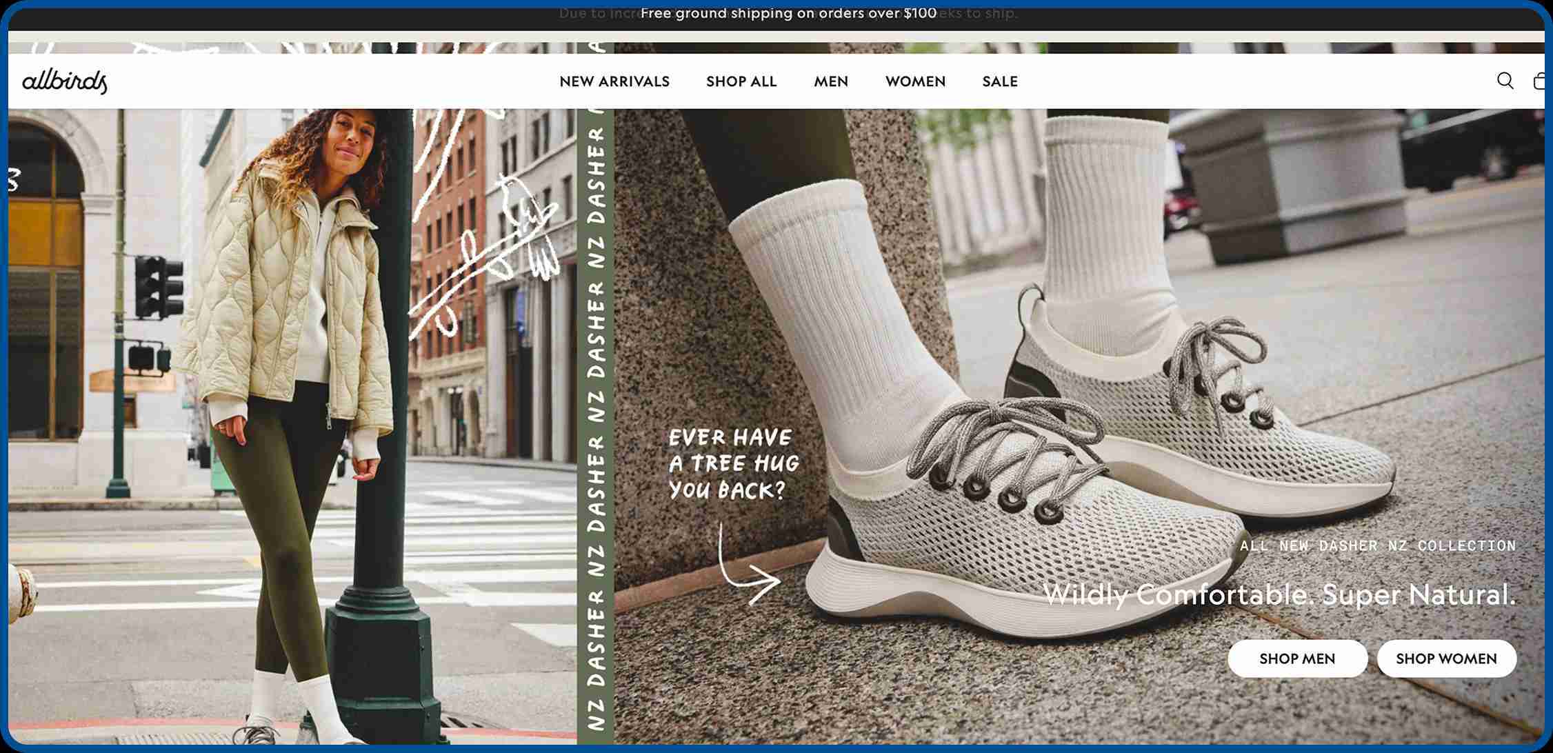
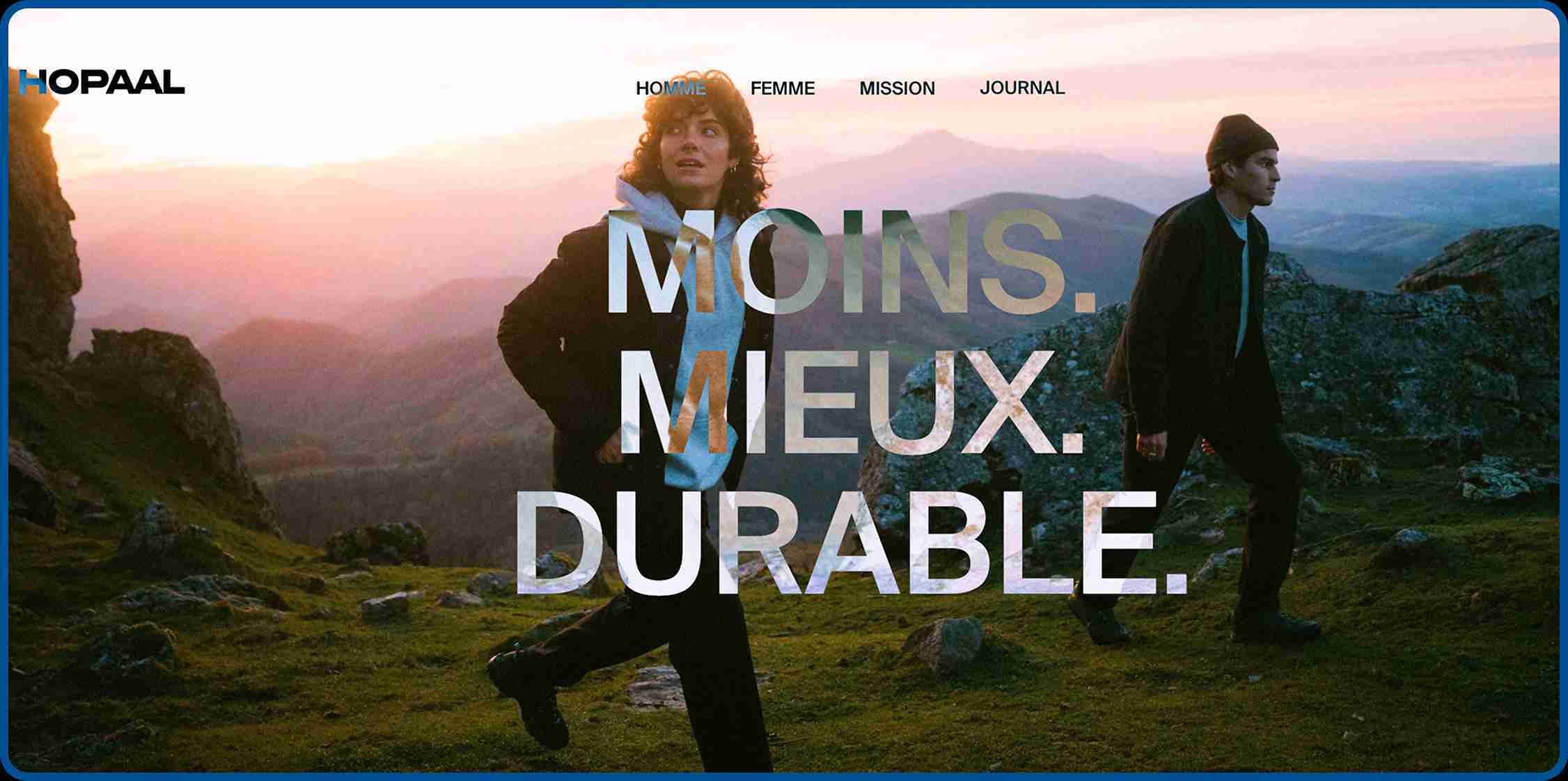
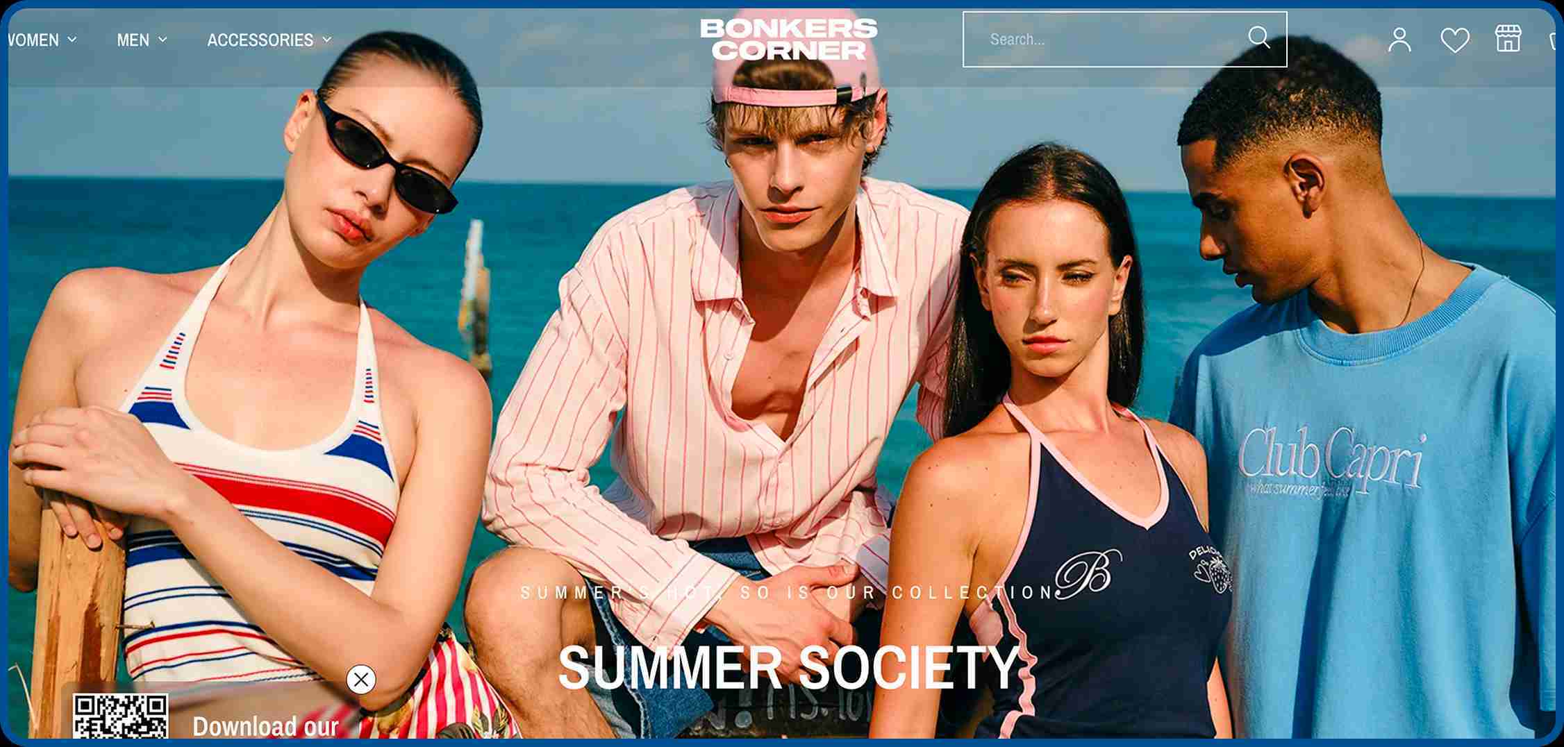
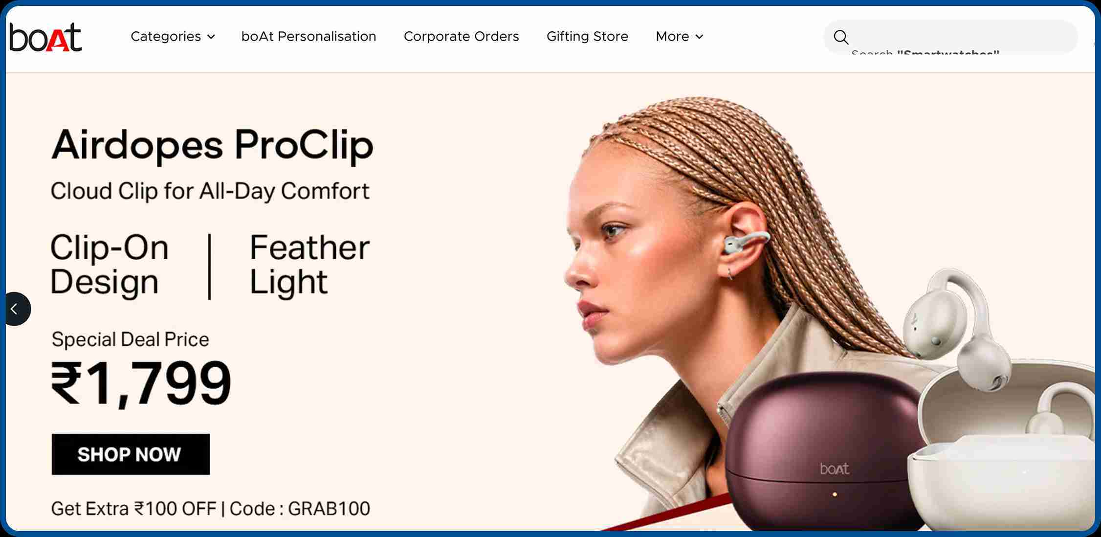
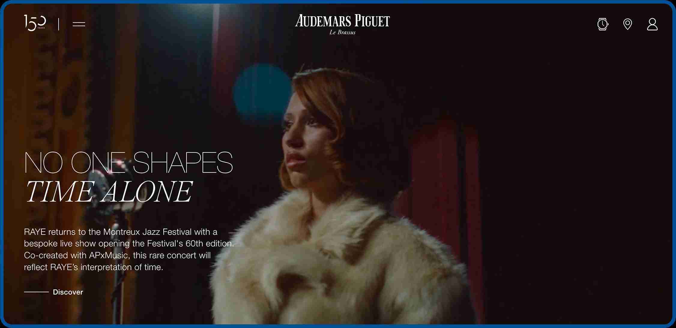
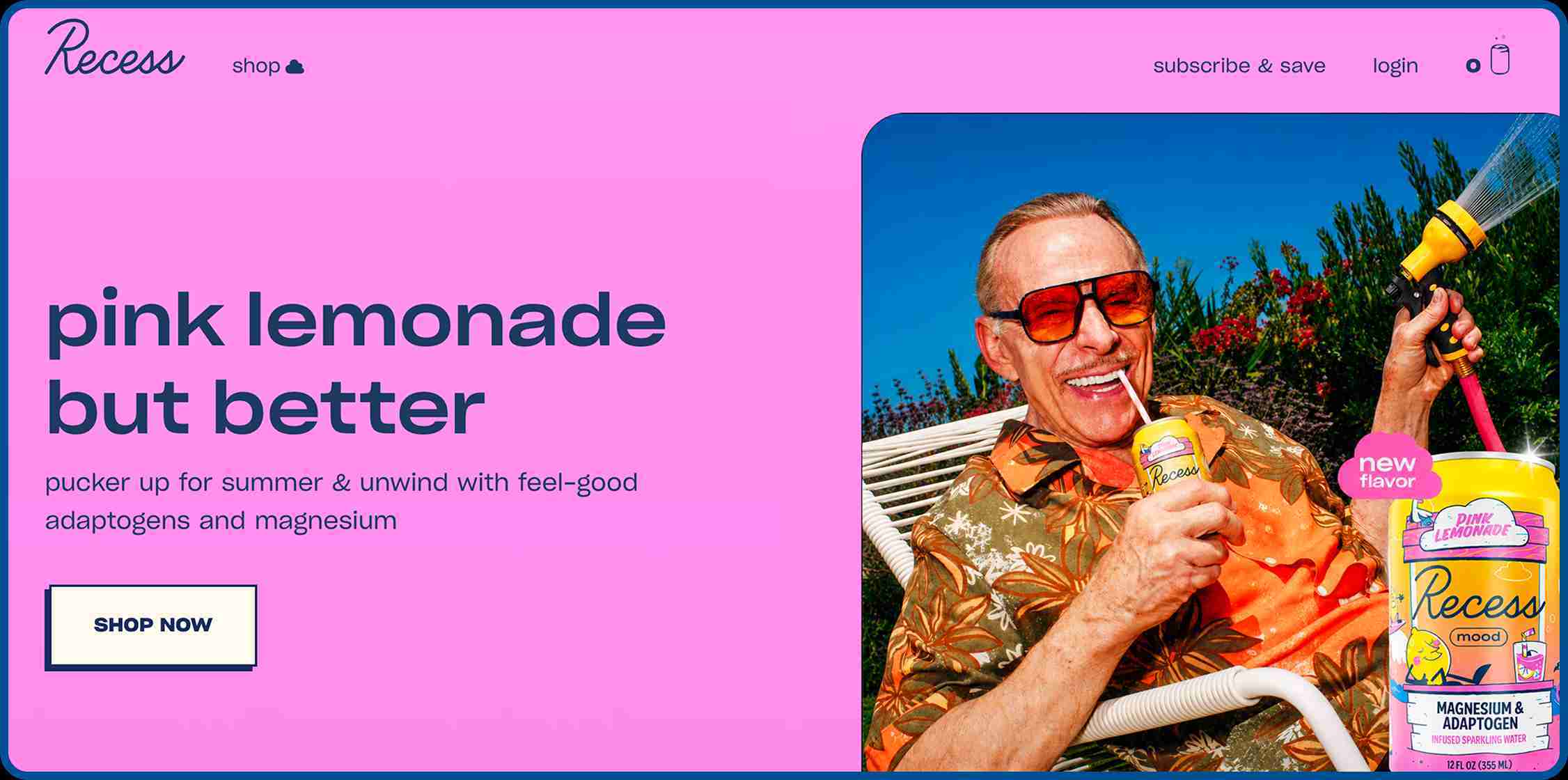
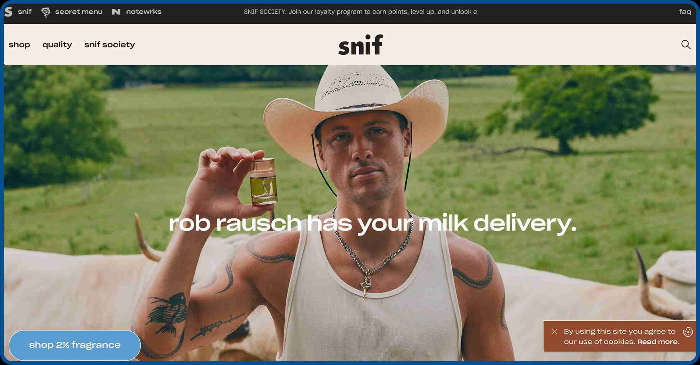
Not one brand on this list uses white-background images as their primary visual. Products are shown worn, used, held, and lived with. The isolated product shot has its place on the product detail page, but it is the lifestyle image that creates desire. Stores that understand this tend to see meaningfully higher engagement from first-time visitors.
Trust signals come before the pitch.
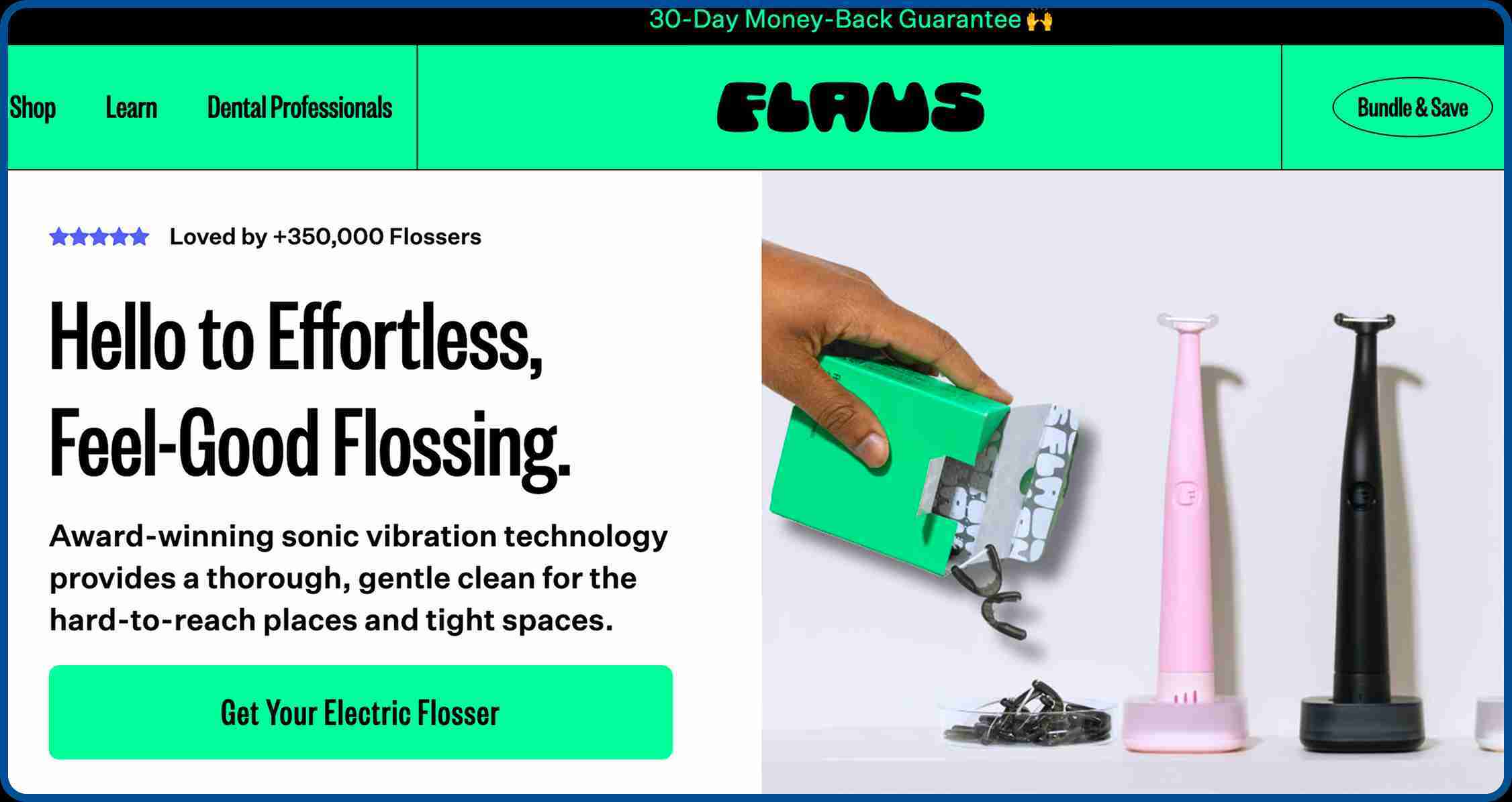
Flaus leads with media mentions. Blume leads with dermatologist testimonials. Summer Fridays leads with usage statistics. The pattern is consistent across every strong site on this list: earn trust first, sell second. A first-time visitor needs a reason to believe before they have a reason to buy.
Navigation is ruthlessly simple.
Top performers cap their main menu at 4 to 6 items. Everything else goes to the footer or secondary navigation. The goal is not to impress visitors with the range of your catalogue. The goal is to get the right visitor to the right product fast. Every additional navigation item is a decision you are asking the shopper to make.
Brand personality is consistent from start to finish.
OddBalls, Meow Meow Tweet, Bonkers Corner, the brands that feel most memorable, maintain the same visual language, tone of voice, and color decisions from the homepage all the way through to the cart. That consistency builds familiarity. Familiarity builds trust. Trust drives both first purchase and repeat purchase.
Checkout is part of the design, not an afterthought.
The best ecommerce websites treat the checkout experience with the same care they give the homepage. Fast loading times, guest checkout availability, minimal form fields, and multiple payment options are all
checkout design decisions that lead to conversions.
 16 Sep 2026
 24 Min Read

_1784866304.png)
_1784867485.png)
_1784866304.png)
_1784867485.jpg)
_1784867485.jpg)
_1784866304.png)

_1784868164.jpg)
_1784866304.png)
_1784867485.jpg)
_1784867485.jpg)
_1784867485.png)
_1784866304.png)



_1790076136.png)